Impressionism – Edouard Manet

Despite visiting London’s National Gallery a few times already, not so long ago I found myself yet again walking through its enchanting rooms. From Botticelli, through Leonardo and Michelangelo to Rembrandt and Turner, every painting continued to be a unique experience, carrying a message of its own. I remembered my first visit a few years back when all I did was look in awe; this time, however, with some historical background at hand, I realized I was paying attention to every little detail, acknowledging the different artistic styles and movements. Maybe that was why one particular painting, which I would have neglected otherwise, made me look closer this time. It was Edouard Manet’s “Music in the Tuileries Gardens”, 1862, oil on canvas. Nothing spectacular at first glance for someone without any experience or knowledge, it shows a large crowd of people gathered to hear a band play. What was it then that made it so special?

Edouard Manet's 'Music in the Tuileries Gardens'

Edouard Manet’s ‘Music in the Tuileries Gardens’

The innovative style, one that would later make people refer to Manet as a pioneer of the Impressionist movement, is definitely a major reason for appraisal. However, it is also his use of realistic and modern themes that is so highly acclaimed today but was found ‘vulgar’ by his contemporaries. Going back to the mid-19th century, the art scene was still heavily influenced by the emotionally-driven Romanticism. Manet opposed this through the choice of his subjects and their depiction, painting various aspects of modern life like fashion and customs. This is evident in “Music in the Tuileries”, which even includes some of Manet’s famous contemporaries, such as Baudelaire and Offenbach.

His “Music” was to be followed by the famous “Luncheon on the grass” and “Olympia” in 1863. The former was banned from being exhibited at the French Salon due to its use of nudity and modern themes, but fortunately “Olympia”, although no less controversial, got accepted in 1865.  As they eventually won the public’s approval, Manet’s paintings gradually contributed towards the emergence of a new movement, which was to heavily influence art and its future development.

Edouard Manet's 'Luncheon the Grass'

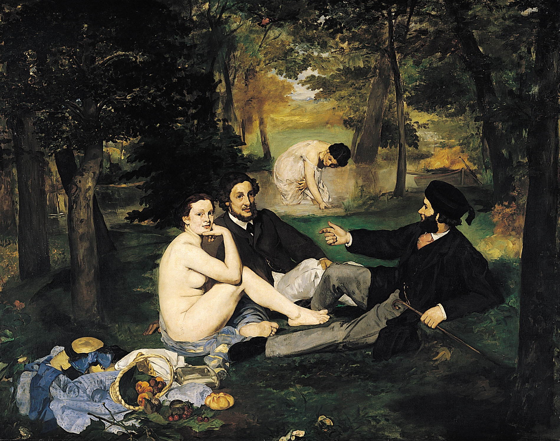
Edouard Manet’s ‘Luncheon the Grass’

Edouars Manet's 'Olympia

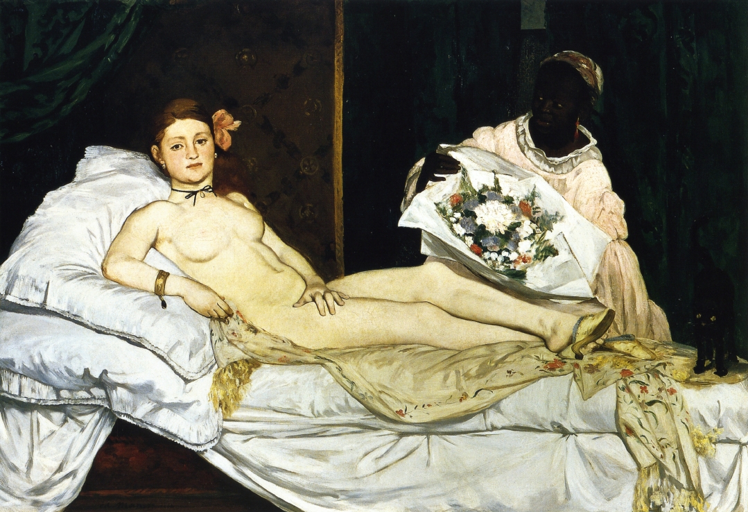
Edouard Manet’s ‘Olympia

J.R.Taylor, Impressionism, 1981, Hennerwood Publications Limited

Tagged , , , , ,

The Power of Montage

What is it that makes a story interesting? The plot, of course, plays a fundamental role in any type of narrative. From the clever joke your heard last night at the pub to that bestseller everybody is talking about, it is often the sole reason for viewers, listeners and readers alike to forget for a while about the outside world and completely immerse themselves into the story. However, no matter how tremendous the plot is, it could still be threatened by failure if the way it is told is no good. Indeed, presentation could often turn out to be just as important as content, a fact proven by the use of different effects and techniques in filmmaking.

One of the best ways to enhance the visual experience of watching a movie is through the use of montage.  Almost a hundred years ago, the Soviet Russian film director Sergei Eisenstein, referred to as “The Father of Montage”, outlined five different types of editing a film: metric, rhythmic, tonal, overtonal and intellectual. What all these manage to achieve if used appropriately is affect the viewer by skillfully (and often – subconsciously) playing with their thoughts and feelings. For instance, tonal montage uses a sequence of shots in a certain context in order to provoke emotion, whereas intellectual montage can combine seemingly unrelated shots in order to communicate a deeper meaning. One of the final scenes in Coppola’s “Apocalypse Now” is a prime example of the latter – the death of Colonel Kurtz is shown simultaneously with the villagers ritually killing a buffalo.

Sergei Eisenstein

Sergei Eisenstein

buffalo

‘Apocalypse Now’ killing the buffalo scene

Aside from Eisenstein’s five types of montage, a curious method of visually affecting the observer is the Kuleshov Effect, created by another Russian filmmaker, Lev Kuleshov, in the early 20th century.  Projecting to an audience one and the same expressionless photograph of a face right after various movie shots, he noticed that majority of the people believed the face was showing different emotions every time.  In fact, they were only attributing their own feelings to the photograph. This effect was later further developed by the great Alfred Hitchcock, credited for his innovative work with cinematic montage and editing.

Quite unfortunately, the visual representation of movie plots in our current century is too often concentrated on CGI effects rather than montage. More and more directors choose the use of eye-pleasing computer-generated images instead of good-old editing, which legends like Hitchcock developed to perfection. Indeed, montage remains the most intelligent way when it comes down to telling a story and is a technique that makes cinema worthy of the title “the seventh art”.

http://kubrickfilms.tripod.com/id21.html

http://en.wikipedia.org/wiki/Kuleshov_Effect

http://www.carleton.edu/curricular/MEDA/classes/media110/Severson/eisenste.htm

Tagged , , , , , , ,

The Bauhaus

Bauhaus Building

Bauhaus Building in Dessau

Bauhaus Logo

Bauhaus Logo

Bauhaus was a school in Germany that combined fine art and arts and crafts. It was a workshop as well, that helped introduce orthodox Modernism to all design media from graphic design to architecture. The art school was  founded by Walter Gropius in Weimar, 1919. The term ‘Bauhaus’ means ‘house of construction’, which stood for ‘School of Building’.

Despite the fact that The Bauhaus’s founder being an architect, the school did not have an architecture department in its first years. However, it was founded with the idea of creating different art departments throughout the years and eventually bringing all arts together. Their school followed a strictly organized syllabus, which focused mainly on the connection between theory and practice. The Bauhaus had a major influence on the development all types of art, architecture, graphic design typography, etc. The school existed in three different major cities in different times – Weimar (its founding city) from 1919 to 1925, Dessau from 1925 to 1932 and Berlin from 1932 to 1933. The changes of venue led to a constant change of focus, style and techniques.Unfortunately, The Bauhaus did not survive long after its founding. It was closed by the Nazi government in 1933 with their thought of it being a center of communist intellectualism.

Syllabus of the Weimar Bauhaus, 1923

Syllabus of the Weimar Bauhaus, 1923

120ee83c33f938940cd1d4aa13b353a8

It is fascinating to realize how, in spite of the fact that The Bauhaus school lasted for such a short time – fourteen years, It has made such a major impact on a great deal of our world’s art. Its principles can be seen in what is thought of as contemporary or modern design today. This could be our homes – interior design, or typography. Much of the interior products we own, chairs, tables, modern decorations such as lamps, etc., can be said to have been influenced by and originated from The Bauhaus.

http://99designs.com/designer-blog/2013/08/15/know-your-design-history-the-bauhaus-movement/

http://www.designishistory.com/1920/the-bauhaus/

http://www.abstract-art-framed.com/bauhaus.html

Tagged , , , , , ,

The Dada Movement

Beginning in Zurich and spreading out to Berlin, Paris, New York, etc., Dada was an art movement of the European avant-garde from the 20th century. The beginning of the Dada movement was the beginning of the breakage of rules in art. It ignored balance, proportion, logic and reason. Being perceived as an anti-art and literature movement, Dadaism was against the way art was appreciated by most of civilization. It is a result of the negative reactions brought on by World War I because of people’s opinion of the war having no meaning or purpose. Their protests against it aimed to show that it was pointless and irrational and therefore produced art that embodied the same meaning as the war – no meaning at all. This new to the time trend suggested that this kind of art was normal for the world they lived in.

One of the most famous ‘ready made’ art productions of the Dada Movement was ‘The Fountain’ by Marcel Duchamp. It is a urinal turned upside-down and signed ‘R.Mutt’, a fake signature.

'The Fountain' by Marcel Duchamp

‘The Fountain’ by Marcel Duchamp

I agree with the idea of associating people’s art with their opinion on World War I. I am not a fan of a lot of pieces of the sort that I have posted above, but there is more to Dadaism that I personally admire. I have come across some beautiful designs that, in their attempt not to follow any rules of Typography or assemblage, have appeared to be completely different from each other. This resulted in a constant growth of the movement, new ideas, new designs, etc. Following are some pieces that caught my eye.

'ABCD Self-portrait' by Raoul Hausmann

‘ABCD Self-portrait’ by Raoul Hausmann

'Dada-merika' by George Grosz and John Heartfield

‘Dada-merika’ by George Grosz and John Heartfield

The above piece is “an almost random mixture of printed ephemera, deliberately lacking all of the attributes of a traditional easel painting.”

Dada poster by Theo Van Doesburg

Dada poster by Theo Van Doesburg

http://www.oxfordartonline.com

http://en.wikipedia.org/wiki/Dada


Tagged , , , , , ,

Ophelia – A Pre-Raphaelite Inspiration

Ophelia (The love of Hamlet in one of Shakespeare’s most popular plays) was one of the main subjects Victorian and Pre-Raphaelite artists used for their paintings because they drew huge inspiration from her. The most famous painting of Ophelia in the scene of her death is the one by John Everett Millais.

Lizzie Saddal was the most famous Pre-Raphaelite model. John Everett Millais used her to pose for his painting ‘Ophelia’. In order to create the perfect atmosphere for his painting, she went through great pains and he had her lie in a bath tub full of water so he could catch every detail of the infamous but beautiful scene of Ophelia’s death. The water was being heated by lamps that were placed beneath the bath tub. Unfortunately, at some point the lamps stopped working and the water in the tub became too cold. The artist, being do concentrated in his work, didn’t notice, and Lizzie didn’t complain. She then contracted a severe cold, after which her father immediately threatened Millais.

John Everett Millais, 'Ophelia'

John Everett Millais, ‘Ophelia’

“Millais’s Ophelia shows an unearthly beautiful woman drifting with palms upturned, just breaking the surface of the water, offering herself to death… The image is one of utter passivity.” – Gay Daly in Pre-Raphaelites in Love, to my opinion, this is one of the greatest, most beautiful depictions of Ophelia from the Pre-Raphaelite period. Looking at some other representations of Ophelia by other artists, I can see a big difference of colors. In Millais’s painting, although all of the colors in the background – the bushes and the grass – are vibrant, he manages to make a contrast between vibrant and vibrant by adding the flowers in Ophelia’s hand. Though them being a small part of the painting, they highly contribute to the  the overall artistic atmosphere in it.

Not less beautiful and powerful, following are other representations of Ophelia by major artists.

waterhouse-ophelia-1889

‘Ophelia’ by John William Waterhouse

'Mort d'Ophelie' by James Bertrand

‘Mort d’Ophelie’ by James Bertrand

'Ophelia' by Antoine-Auguste-Ernest Hebert

‘Ophelia’ by Antoine-Auguste-Ernest Hebert

'Ophelia' by Arthur Hughes

‘Ophelia’ by Arthur Hughes

'Ophelia' by Henry Lejeune

‘Ophelia’ by Henry Lejeune

Like many other art movements, styles, inspirations, Ophelia is depicted not only in paintings, but in music, beautiful music as well. This is a song from the end of the play ‘Hamlet’ i saw in Bulgaria, which came to be one of my favorite songs since.

http://www.victorianweb.org

A Sanctuary for Sisterhood

http://www.bbc.co.uk

http://en.wikipedia.org

Tagged , , , , , , ,

Rococo Art

There are different artistic modes coming from the Rococo art movement. Furniture, Architecture, Sculpture, decorative objects, music, etc. I would like to focus more on Rococo painting. This beautiful art movement appeaing right after the Baroque period in the 18th century, Rococo developed in Paris, France. The transition from Baroque to Rococo involved a change of emphasis from the extravagant to the more airy, delicate, graceful. Rococo painting has an intent to please rather than containing the intense emotions of the Baroque. Rococo is also referred to as ‘Late Baroque’.

A very important representative of the Rococo movement is Jean-Antoine Watteau. Considered as the first great painter of the movement, his work is thought of as the absolutely perfect personification on the Rococo spirit, later influencing what now are considered great artists – Francois Boucher, Jean-Honore Fragonard, etc. The following paintings are a clear example of the artists’ attempt of creating an ornamental and elegant look to their artwork.

Francois Boucher's 'The Setting of the Sun'

Francois Boucher’s ‘The Setting of the Sun’

Francois Boucher's 'The Rising of the Sun'

Francois Boucher’s ‘The Rising of the Sun’

The work of whom I am most keen on from the Rococo movement is Jean-Honore Fragonard’s, especially ‘The Swing’. The reason for that is because he manages to succeed in his attempt to create a dreamy mood and a calm atmosphere with the light colors and the delicate brush strokes he uses.

Fragonard

Jean-Honore Fragonard’s ‘The Swing’

Jean_Honore_Fragonard_FRJ005

Jean Honore Fragonard’s ‘The Souvenir’

http://en.wikipedia.org

A.C.Sewter, 1972, ‘Baroque and Rococo Art’, Thames and Hudson Limited

Tagged , , , , , ,

The Importance of Writing in Cursive

2013-11-30 23.39.50

Of course, like every single theme of conversation and opinion, cursive writing is of different importance to different people. For some, the fact that nowadays there is less handwriting and more typing, is a good sign because it has a meaning of technology evolving. My opinion, however, is quite the opposite. Yes, it might mean that technology is rather taking positive steps of development, but is this actually a positive fact? As I have written in a previous post, technology is becoming more and more of an addiction to the majority of our society. This is a major reason for the lack of development in the, no doubt, beautiful cursive handwriting.

Nowadays people who communicate from a distance do it electronically through social media, e.g. Skype, Facebook, e-mail, text messaging, etc. Yes, it is easier that sending direct mail and waiting for days for it to arrive, but the magic of knowing that your friend/ mother/ father/ boyfriend/ girlfriend/ son/ daughter, etc, is gone. Handwriting is one of a kind. Every single person on the planet has their own unique handwriting, even if it is not particularly cursive, there is not one duplicated type of handwriting, as opposed to standard typing which is the same and has no individuality whatsoever. Knowing that that significant other has touched the letter, handwritten it,  and not jus typed it, that gives you the feeling of closeness. It gives you a feeling of a warm connection with them. It is personal. This feeling is now mostly gone and not many people realize it. Because of type, generations are gradually losing the ability of writing in cursive.

‘The eyes are the window of the soul’. Well, I can say a similar thing about handwriting. It is the window of the emotions. Cursive writing expresses them in a way that obviously cannot be compared to type. You can almost tell of a person’s feelings, their state of mind, or even their character from when the were writing something.

Handwritten letter

Handwritten letter

To answer the question ‘is the ability to write in cursive today useful?’ – yes, for a number of reasons, it is. Learning to write in cursive develops the accuracy and precision of the hand. Let’s face it, cursive handwriting is, to my personal opinion, a kind of an art form. Let’s move on to Calligraphy. The appreciation of cursive handwriting has led to the appearance and development of this elegant and beautiful type of art. It can be from simple elegant and creative titles and illustrations, to fascinating urban calligraphy, to graffiti. Personally I admire all kinds of graffiti – characters, pictures, objects, etc. But to keep it in the topic, I will not get carried away and I will stick to talking about calligraphic graffiti, or, as some call it, calligraphiti. To many, street art is vandalism, but to others, myself included, it is a beautiful and important  art form. I think it makes our world a more beautiful, colorful, unique place.

calligraphycalligraffiti1Calligraffiti1-2Urban-Calligraphy11sweeping-beauty-ii

Tagged , , , , , , ,

History of Text

The beginning of literacy is a process that has developed over a great number of centuries.

hieros – sacred, glypho – inscriptions. (Greek)

Hieroglyphs are most commonly associated with Ancient Egyptians. They believed that hieroglyphics writing was a work of God. The earliest known examples of writing in Egypt are said to be around 3400 B.C. The hieroglyphic script was mainly used for illustrating on the walls of tombs and temples, monumental inscriptions.

Hieroglyphics, Photo: http://imc.mbhs.edu

Egyptian Hieroglyphs, Photo: http://imc.mbhs.edu

Hieratic is a more cursive form of hieroglyphs and they are both closely related. It was written by hand and its evolution is a result of a quick attempt of drawing signs in a simpler form on papyrus (papyrus is a type of paper which is thin and is made from the pith of a papyrus plant), with the use of a reed brush. Hieratic was mainly used for religious writings, literature, wisdom texts, etc. Basically, Hieratic was used for texts which contents were more important than their appearance. Same as hieroglyphs, it could be written in rows and columns, but over time, it became standardized into writing it only in rows from right to left. The fact of their development being one from another is unknown but I can say that they are both not just beautiful, but powerful and influencial as well.

Hieratic on papyrus sheet

Hieratic on papyrus sheet

Papyrus sheet

Papyrus sheet

Demotic writing is an even more cursive type of writing that Hieratic. Its development led to it not being able to resemble visually the concept it represented. It was used in administrative context rather than religious context like Hieratic.  Demotic writing was used until about 400 AD when the Coptic alphabet replaced the use of all three scripts – Hieroglyphic, Hieratic and Demotic. It is important to be noted that through time, while the tree types were developing, none of them replaced the use of the others, because they were each used in different context.

Demotic writing

Demotic writing

With its history going back to the Hellenistic period, The Coptic alphabet is based on the Greek alphabet and was developed from the Demotic script. It is the first alphabetic script used for the Egyptian language.

Coptic alphabet

Coptic alphabet

http://www.egyptvoyager.com

http://scriptsource.org

http://en.wikipedia.org

Tagged , , , , , , , , , , , , , ,

“First we build the tools, then they build us” – Marshall Mcluchan

I would like to share a little bit about how social media has taken over the lives of most of civilization.
Modern technology arrived into our lives not that long ago – a few decades. Mobile phones, for example, were invented to help people communicate with each other in an easier way. Sadly, through time, it ended up doing exactly the opposite, as did the computer, the internet and all social media websites created since. Society’s idea of “communication” changed.

It is amazing how many things addiction to social media doesn’t let people realize. Sherry Turkle, professor from MIT, has made some very true points about society’s relationships nowadays in this TED Talks presentation video.

The ironic fact is that, actually, with all of these “communication” devices, we’ve never been so connected, yet we’ve never been so alienated from each other. The sources of communication – phones, computers, internet, Facebook, Twitter, MySpace, etc., are thought to be helping people to socialize, which is true on the one hand. But on the other hand, with it becoming more and more popular, gives the people, who mainly use this type instead of face-to-face,  the idea that this kind of communication is now completely natural and, because of that, they don’t feel the need for live interaction.

“The Innovation of Loneliness” – Very well said.

I thought this was a relevant to the theme video with a very good illustration of the flaws of social media. A motion graphics video I stumbled upon a while ago that made an impact on me and I think It would speak to people. It gives a powerful message, presenting information about the consequences of social media addiction and, as a bonus, combined with beautifully and creatively developed illustrations and graphics.

Tagged , , , ,

Pareidolia

“Para” – a Greek word meaning faulty, wrong, instead of, etc. and edolon – meaning image, shape.

Pareidolia is the psychological phenomenon that causes some people to see a random image of something (most commonly a face, or an animal, or an object) onto another image of something that has nothing to do with it and is completely different. You can see a face on your toast, an animal in the sky, a grumpy old man that the foam on your cappuccino has shaped, the stain spots on your blouse, the happy face in your food, or even something in your own artwork of splattered paints from when you were a toddler. Most people don’t realize how astounding this is and don’t think of it as an art form, which it actually is.

360px-Fakeface.svg

Starting with the most simple example that could be given, this is an image of two small circles and a line within one big circle. The human mind will immediately subconsciously associate it with a human face, although it does not resemble one that much.

For people who are religiously inclined pareidolia is considered to be a something that is not random, but a miracle.

skullflower

pareidolia6_face

There isn’t just one type of pareidolia. One is the more realistic images you see from natural objects. Another type is the Rorschach Inkblot test which uses pareidolia with an attempt to understand and identify a person’s mental state.

The Rorchach Inkblot

The Rorschach Inkblot

Another type of pareidolia is seeing images of simple (illustrative) faces on everyday objects. I have also taken some photographs of those – fences doors, etc, around the University of Dundee and I have drawn the exact form of face I can see from them.

1

11

22

2

33

3

DsSC_096assa4

cc

DSC_022aa96ddaa4

s 

444

44

Tagged , , , , , , , , ,